Graphic Design, Accessibility, and Listening: The Responsibility of Visual Communication
by Francesca Martini - Graphic Designer, We Exhibit
“Beauty is not what is beautiful, but what people like.”
This simple, popular saying captures a powerful idea: beauty is subjective. And here lies one of the great ambiguities surrounding graphic design—especially when it is reduced to a purely aesthetic exercise.
Graphic design is, first and foremost, a functional tool. It supports comprehension, wayfinding, and access to information. This doesn't devalue experimentation (what I like to call “design for designers”) or its more expressive, artistic side. But that's a different field. Here, we want to talk about useful design—the kind that helps us when we’re navigating unfamiliar spaces and, without needing words, clearly shows us where to go, what to do, and who we’re engaging with.
Design as a Practice of Listening
Being a graphic designer today means listening, translating, adapting, and facilitating.
Listening is the first step in any project.
Whether it’s literal—hearing the voice of a client, a community, or a specific audience—or more intuitive, it remains a moment where the “outside world” expresses needs and seeks meaning.
The designer has both the privilege and responsibility of acting as a mediator between needs and solutions—turning raw insights into potentially universal forms.
This is where translation comes in: a delicate act, balanced between reason and sensitivity.
Translating content into visual form requires a balance between collective knowledge (shared symbols, visual language, semiotics) and personal intuition. I see green—I think of nature. But maybe, to represent nature today, I need to tap into new imagery, cross-pollinated with other worlds. Designers observe everything, constantly. Often, the best answers come from elsewhere.
Once the right form is found, it must be adaptable—able to function across different contexts.
An effective visual identity doesn’t live on a blank page alone. It needs to work across channels, media, and existing spaces—from an Instagram feed to a booth wall, from a website to a paper bag.
Good design doesn’t impose itself—it engages with what’s already there. This doesn’t mean innovation from scratch isn’t possible. On the contrary: today, more than ever, there’s room to rethink everything—breaking down outdated visual hierarchies and redefining formats and approaches.
And this brings us to facilitation.
Facilitating means rethinking systems—designing based on real, inclusive, and current needs.
Sometimes it means removing, simplifying, making space.
Because when we truly begin to consider the needs of more people, we realize that design must operate on multiple levels.
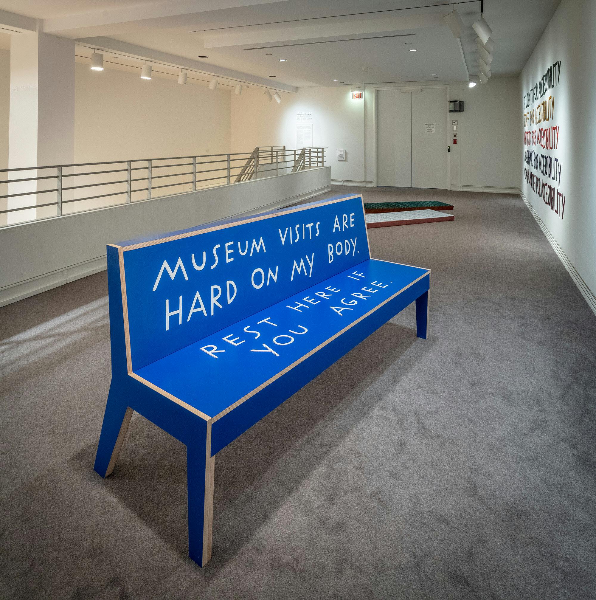
Accessibility isn’t just a technical issue—it’s a political, social, and cultural act.
To facilitate is to enable independence.
Only when people are free to understand, choose, move, and participate can new ideas, actions, and opportunities emerge.
That’s how we begin designing spaces—visual and otherwise—that don’t exclude.
Spaces where everyone can feel like a part of something, not just an observer.
Accessibility = Opportunity
“Accessibility is about removing barriers (cognitive, cultural, economic, sensory, motor, representational, etc.) in order to make participation possible for as many people as possible.”
— Maria Chiara Ciaccheri
Designing for accessibility means starting off on the right foot.
It means anchoring your thinking in listening—from the earliest stages—and considering a wide range of needs, many of them often invisible.
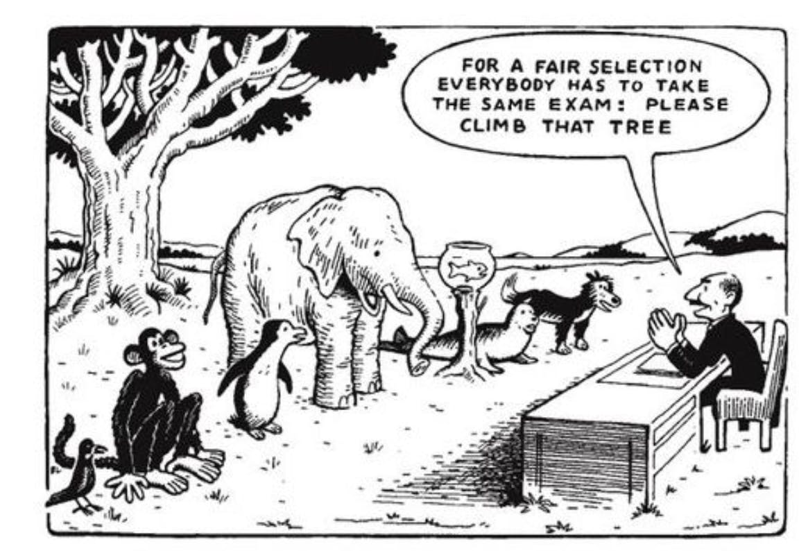
If we paused to reflect on the barriers faced by those with a high level of mismatch—a misalignment between a person’s abilities and the demands of an environment—we’d realize that no one is truly exempt.
Whether someone has a permanent disability (missing an arm), a temporary one (a broken arm), or a situational one (carrying a child), the needs converge.
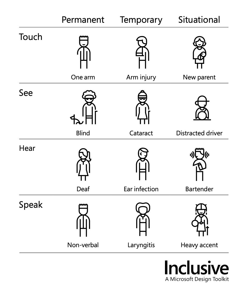
— Inclusive, A Microsoft Design Toolkit
That’s why designing for accessibility isn’t just an ethical gesture—it’s a smart choice.
One person’s need can become a benefit for many, and a good project is one that makes life easier for everyone.
In graphic design, the examples are practical and everyday:
The right contrast between text and background, or the choice of a typeface for a 300-page book.
Minor details? Perhaps. But they make the difference between comfortably finishing a text—or giving up halfway.
And everyone benefits from these choices.
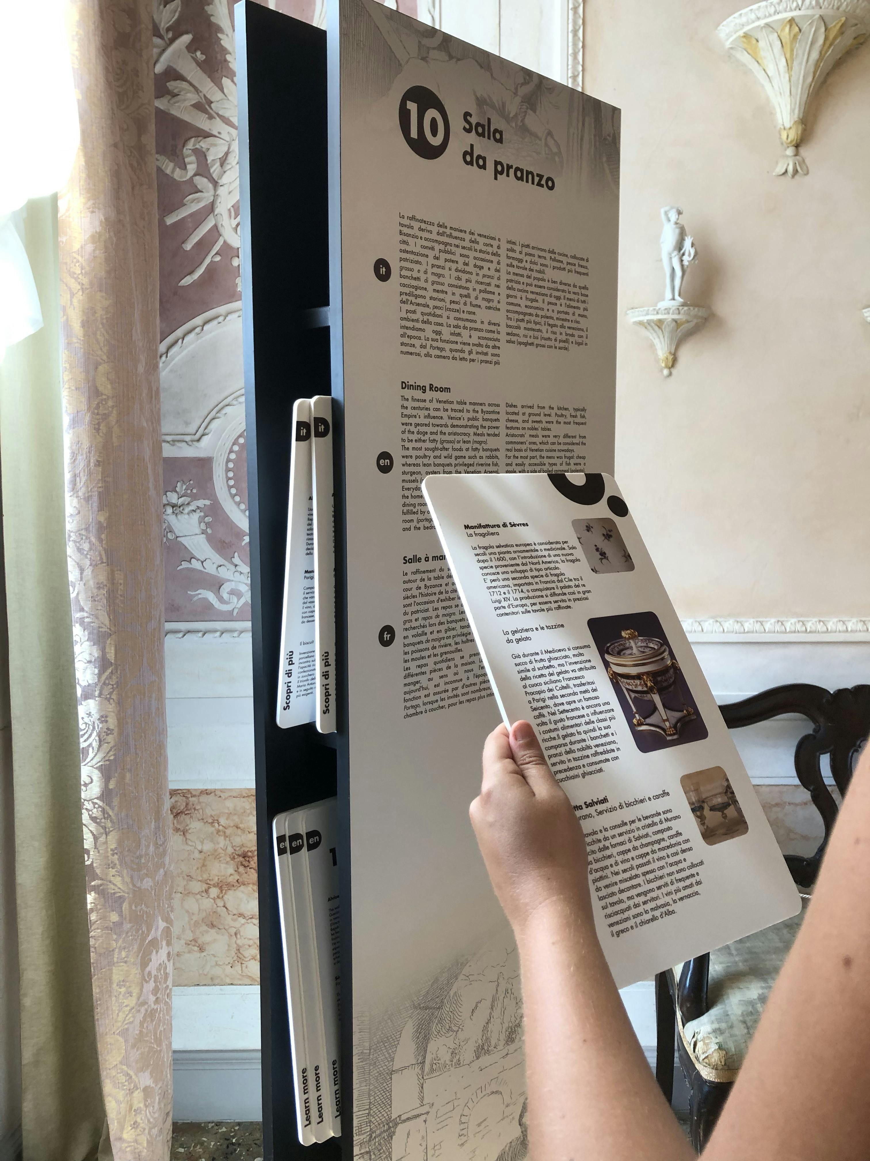
Designing for Accessibility: Where to Start
When it’s hard to imagine the full range of diversity—or we don’t have a way to directly involve people in the design process—we can still make conscious choices.
There are tools and guidelines that help us design with greater awareness, avoiding improvisation while keeping visual quality high.
Here are some useful starting points:
- Cards for Humanity: An online tool offering diverse personas (abilities, age, gender, context).
Helpful for simulating use scenarios and identifying design barriers.
Key Guidelines:
- For digital content: WCAG (Web Content Accessibility Guidelines) – the global standard for web accessibility.
- For physical and environmental graphics: Documents like those from the Canadian Museum for Human Rights offer valuable insights for exhibition spaces and printed materials.
Quick-Check Tools:
- Contrast Checker: it verifies text readability against background color.
- Tipometria: it calculates the optimal ratio between font size and line spacing.
At first, these rules may seem like they limit creativity. But over time, they become a valuable toolkit—allowing you to innovate with clear intent and build solid, readable, and adaptable projects without sacrificing visual identity.
ART IS IN THE PROCESS
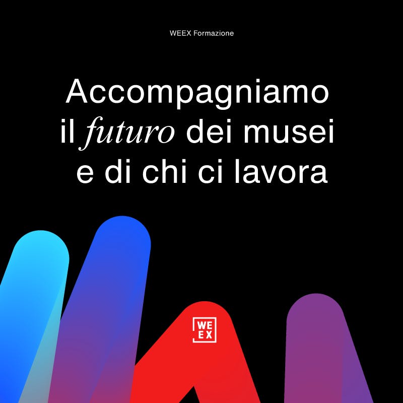
A great example of a visual system designed to be clear, coherent, and versatile is the 2023 rebranding of We Exhibit.
The identity was redesigned to more accurately represent WEEX’s evolution and values: openness, collaboration, and transparency.
The new logo retains the “We Ex” acronym inside an open frame—evoking both a picture frame and the floor plan of an exhibition space.
Visual choices—from color palette to typography—were carefully crafted to ensure legibility, balance, and recognizability in a variety of contexts.
The system naturally adapts to new applications while staying consistent and true to its identity—such as in the sub-brand created for the Training Series.
This project shows how accessibility can serve as a guiding principle for identity—without sacrificing personality or distinctiveness.
Because in the end, graphic design is not just what you see.
It’s what enables you to see, to understand, to navigate, and to feel included.
In an increasingly complex world, designing with care and responsibility means building bridges between people and closing distances—making encounters possible.
That’s the challenge for designers today.
Francesca Martini - Graphic Designer